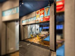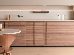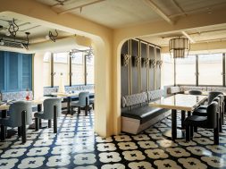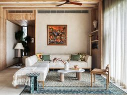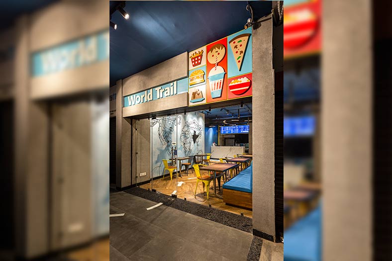

World Trail designed by Dhruv Sarveshwar Lal & Associates is a perfect combination of enjoying a chic vibe with mouthwatering cuisine.
In today’s time, design and brand integration go hand in hand. Many designers are called upon by clients to ensure that their project design resonates with the brand image they want to disseminate. The World Trail project designed by Dhruv Sarveshwar Lal & Associates in certain ways is a testimony to this fact.

The project is based in the Chandigarh Tricity Area in sector 70, Mohali (S.A.S. Nagar). Sheetal Sharma, Principal Architect & Dhruv Sarveshwar Lal, Founder, Dhruv Sarveshwar Lal & Associates, who executed this project point out, “The owners were associated with a top MNC F&B brand for the past more than 20 years, bearing the responsibility for its development and expansion. Their journey and experience lead them to; with a vision and passion for good food; embark on a trail to find, develop and serve the best renditions of dishes; leading to the formation of the multi-cuisine F& B venture – World Trail. The client was keen to redevelop the brand with a distinct identity/exclusively of its own, different from its existing global cuisine F & B brand with an interior that could interact, adapt and expand further. A time span of 75 days was given to us to complete the project from designing to comissioning.”

Restaurants need to have dedicated spaces to function properly and at times can pose a challenge but in World Trail, the designers faced a different kind of challenge. “A chic minimalist interior was a conscious decision from the word go for Word Trail,” says Dhruv, “considering it was a restaurant that was growing into something larger and its adaptability and scalability to all model types and sizes was a pivotal factor for the design developed. It consists of about five designated spaces overall. The challenge was not how to segregate them but rather to integrate them, in an attempt to make the space seamlessly look larger than the actual floor plate of 900 sq. ft. When it comes to an F & B outlet, there is always a site-specific degree of difficulty to integrate services while having an optimum work flow and functioning keeping in mind the presentation and maintainability.”

“To execute any project successfully irrespective of its size, team effort and the materials in use matter. In executing this restaurant some of the branded materials utilised were from Asian Paints, Nexion Tiles and Jaquar lighting likewise the young artists and sculptors of the city, all have been major partners while executing the finishing stages of the design.” points out Sheetal.

In executing this project Dhruv and Sheetal have tried to ensure that the space defines the brand image, to achieve this symbiosis they gave a lot of thought to the design concept invoking in it a certain degree of symbolism make it more impactful “Design and the interaction have to move out and beyond the four walls (borders) it was meant for. Be bold enough to experiment with elements and their planar existence. A single element can bind a space. Symbolism based design is a key element that culminates into an identity and initiates interaction to form a consumer base. Chic minimalism is the go-to for entrepreneurial ventures and time is a major resource for entrepreneurial ventures.” concludes the duo.
