The Bachelor Pad
Design Deconstruct creates a bachelor pad spread across 4,000-sq ft in Vasant Vihar, New Delhi
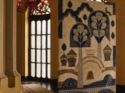
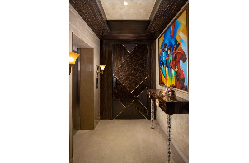
Designed to suit the lifestyle of its bachelor owner, this apartment in Delhi’s Vasant Vihar showcases clean, elegant and unobtrusive design that also features eye-catching luxury elements. The brief was to keep things simple and stylish, without going overboard with design and styling. This being the third residence that we have designed for the client in the last seven years, we were perfectly clued in to his sensibilities and lifestyle. The home is entirely staff-operated, so we ensured that the interiors were low-maintenance and of a utilitarian value well. The private elevator of the residence opens in a vestibule, which is adorned with a sleek console and a colourful Radha Krishan painting right above the table.
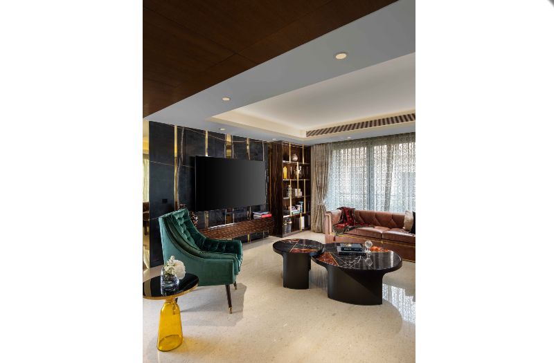
Since the client enjoys entertaining friends and family at home, the design was centred around that need, with a free flowing living-dining and lounge space. The client also loves his TV viewing experience and needed a dedicated space for it. We curated a lounge out of the massive living area complete with a surround sound System.
A striking matte finished marble, accentuated with steel finished in rose gold, forms a gorgeous backdrop behind the television. The display unit beside it showcases pieces collected by the client over the years. The rest of the TV unit is in veneer with polyester finish. Comfy and stylish leather sofas that will only get better with time, and an accent chair in a deep green hue, make for luxurious seating. The centre tables highlight a simple, yet impressive form with the stone top in red agate highlighted with brass inlay and black marquina.
A stunning console in hand-cut glass with a petrified wood top stands in between the lounge and the living room. This is also the first thing you see on entering the living room. A background panelling with bevelled glass and veneer offers a striking Contrast.
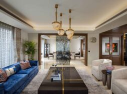
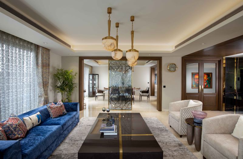
The adjacent living area, which encourages conversations, consists of formal seating. With a plush sofa in a regal blue, we played around with the colours and prints of the cushions to add character to the otherwise muted scheme. The carpet adds luxury and warmth, and the chandelier made out of alabaster stone adds a classical Touch.
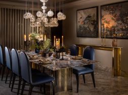
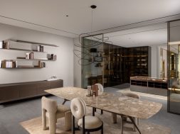
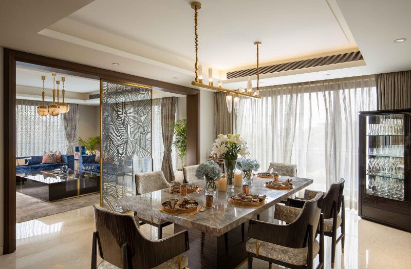
The ceiling design is as simple as possible, which is usually the case with most of our designs. That, along with the neutral palette, sets a natural backdrop for the well thought out design elements to shine. The dining area next to the living room is separated by a metal screen in a custom designed pattern that visually divides the spaces. With a table that has a beautiful marble top with shades of blue, adds a simple, yet luxurious note to the room.
For the mandir, the client wanted a serene, yet exclusive design. We selected a mix of modern geometric design and ethnic Indian work on the walls. The backdrop has been done in 45 mm thick stone, which allows us to achieve a nice layered finish.
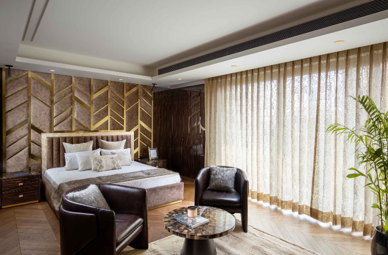
In the master bedroom, a herringbone patterned wooden flooring creates a warm and cosy vibe. The massive windows allow a lot of natural light to permeate into the room. A wall panelling done in a combination of wood and brass adds a rich layer to the room. A sleek TV unit with a dresser alongside, completes the picture.
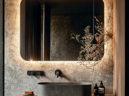
The spacious master washroom is done up with stunning onyx on the floor and the walls. We have used tiger eyes in a chevron pattern to bring some drama to the washroom. The guest rooms and bathrooms are fuss-free, yet elegant and intimate, with a neutral palette.
Overall, employing design that is easy on the eyes, the home still manages to impress with unexpected design elements.
