‘Osum project’ features a modern, minimalistic and monochromatic aesthetics
Tushar Mistry, Principal Architect of TMDS, speaks about his design while detailing his marvellous work.
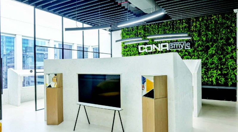 No barriers often lead to outstanding work; every designer looks for tasks where he can passionately exhibit his artistic creations. For a project to succeed, both the client and the designer must be equally passionate about it. The designer should also have some latitude regarding constraints like budgets and deadlines. The “Osum project,” with its headquarters in Lodha Supremus, Mumbai, was one of our most recent projects that were an absolute pleasure to work on. Cona Lightings and Switches, the client, is a technologically oriented business; as a result, the design of this office space is heavily reliant on automation. The customer fully supported our concept, and their equal participation in every minute aspect helped make this unique work possible.
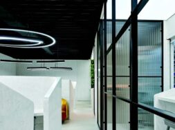
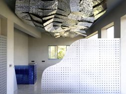
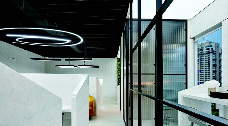
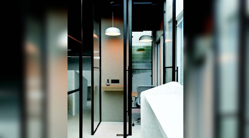
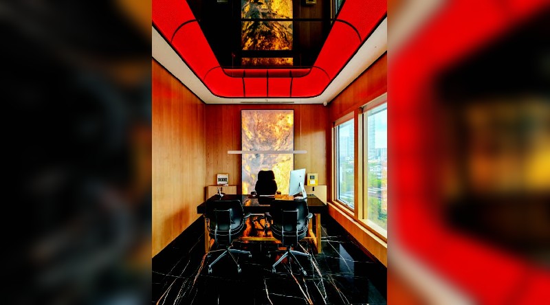 The “Osum project” has a flowing,contemporary, minimal, and monochrome appearance. Our strategy was to keep things relatively straightforward while paying close attention to small touches that would eventually give the area a smart yet fashionable appearance. In this endeavour, we made extensive use of shapes and curves.
The predominant colours utilised in this commercial space were white, black, and grey, with subtle red accents that made all the difference. Computer numerically controlled (CNC) designs carved out of solid Corian surfaces are used to make the walls. The crucial point is that, due to the shortage of raw materials brought on by the COVID-19 pandemic, we spent a lot of time and effort finishing that wall portion in particular. However, today’s finished design reiterates that the wait was completely worth it.
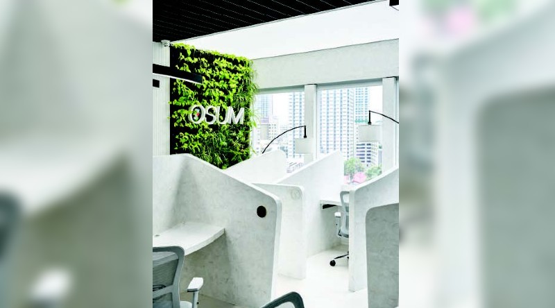 Corian solid surfaces predominate because they show off superb workmanship. A glance at the Corian-made cable organiser, phone charger, pen holder, and other tabletop accessories will demonstrate how well they match the desks. The design of this area has also been significantly influenced by technology.
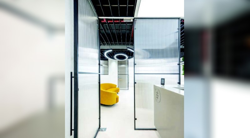 Corian solid surface cabinets are equipped with sensors and open with access cards. Therefore, the complete lock and critical appearance have been eliminated from the design of staff lockers and cabinets, resulting in an accessible, timeless, stylish, and clutterfree appearance. Everything is built with a motion sensor, including the entry and exit points, music, and lighting, creating a zone that offers a complete experience. A mixture of marble dust was used for the flooring solution, which has been processed to give it a matte appearance that matches the rest of the office space’s decor.
 The Managing Director’s cabin project posed one of our greatest difficulties. Although it appears simple and elegant, the ceiling design we had in mind would be exceedingly challenging to achieve. Despite trying a variety of materials, including red Corian, MDF, CNC cut, and painted red, we ultimately wanted something else for that room.
 Finally, a small rope in my hand gave me a clue to achieve the desired effect by choosing the most understated and refined material—a white cotton rope. The white cotton rope, which was coloured, dried, and varnished throughout, was beautifully balanced for the stunning ceiling appearance. While working on this project, I discovered that sometimes the essential elements could help create the grandest décor.
