House of Lines crafts home with subtle interior
Discover delicate beauty with House of Lines’ minimalist design, which turns a high-rise in Chennai into a reasonably priced luxury.
Interiors that are understated and simple are elegant. “I want the house to reflect elegance, but at an affordable price,” was the straightforward request. The client gave the studio a one-line brief, and that was where the tale of the interiors started. Minimal interior design is a concept that designers frequently find difficult to market, and it is not always possible to create an atmosphere that is based on minimalist ideas. For House of Lines, minimalism is not misinterpreted as it is frequently.
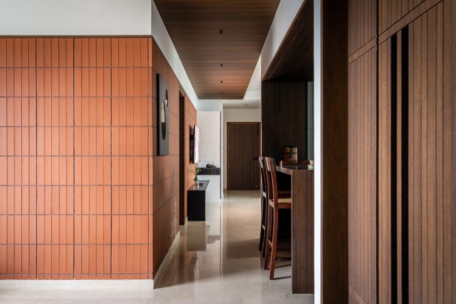
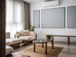
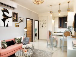
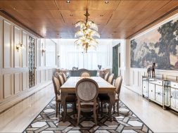
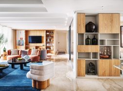
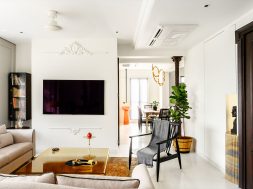
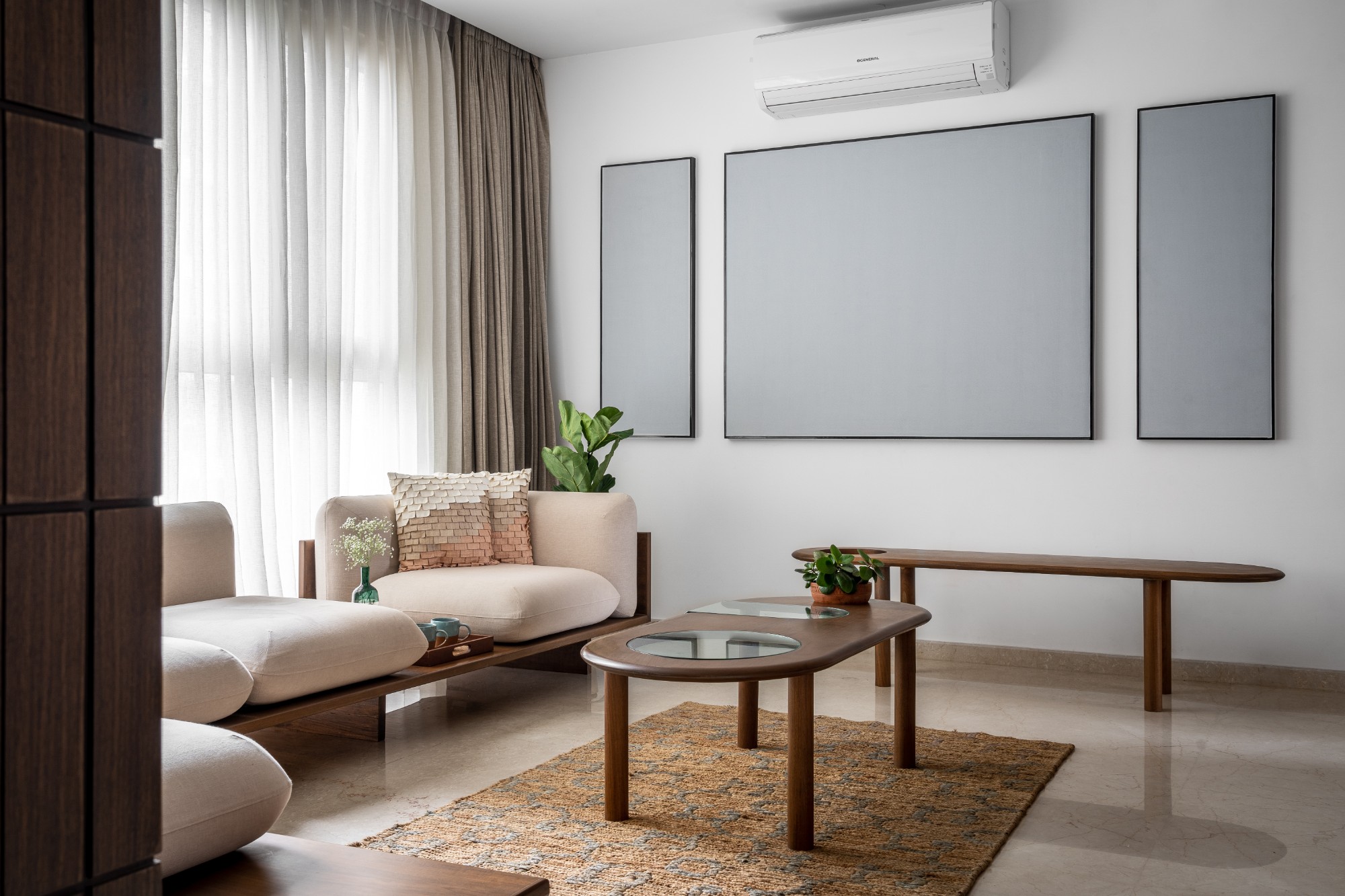
The 2200 square foot interior design project of a high-rise flat in Chennai embodies the studio’s approach and attitude. The only thing that contrasts in the apartment is the usage of vertically fastened clay tiles on the internal wall. This draws the viewer’s attention to a wider area, and the colours which are primarily grayscale are employed to accentuate the size of the area. Thus, the fluidity created by the colour scheme breaks up the rigidity of the spatial arrangement. The handcrafted, masterfully built furniture complements the colour palette. The furniture’s design expresses solidarity by utilising wood, a single, unique resource. The material is light in weight yet strong in nature, and it isn’t mixed with any other material out of pure material respect. The living room’s blank frames, which enhance the apartment’s ‘lightness’, let in the lightest possible.
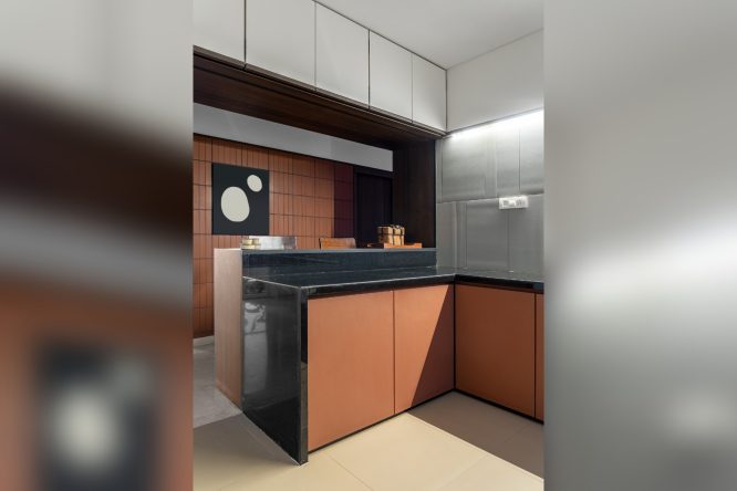
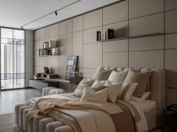
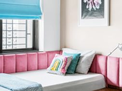
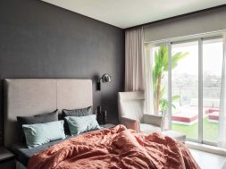
Various colour schemes are used in each bedroom based on the preferences of the client. One of them is a pastel pink, with a backsplash on the bed that mimics the design of a coffered ceiling but on the wall instead. Richness and style are exuded by the solid wood wardrobes. The wardrobe shutters and door handles combine to form a single panel. There is a handleless modular unit in the kitchen. The kitchen’s granite counter is adorned with an intriguing wooden breakfast bar.

It is cleverly built to not take up much space and doesn’t obstruct the passageway. The chairs may be hidden beneath the counter. The high breakfast counter looks great with two high chairs. Subtlety is defined by the asymmetrical arrangement of wooden pieces in the shape of rocks on the wall.
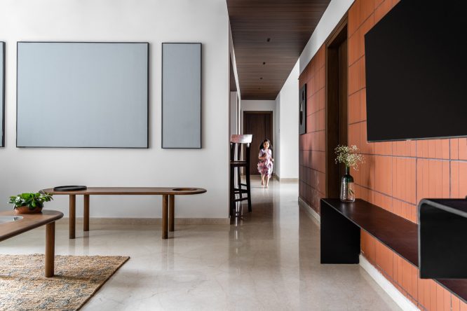
The apartment as a whole exudes elegance in every detail, colour scheme, and material selection. The apartment’s design was centre around rustic and earthy characteristics, which is why wood and clay tiles are often used. Sometimes the less is more, and interior design tells a space’s story while letting the less take centre stage and accentuate the space’s silence.
For more details , Visit: https://www.instagram.com/house.of.lines/
