


The leading names of the design industry come together to talk about the importance of colours and how it influences the decor in their respective areas of specialization.
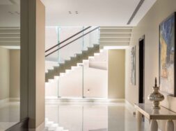
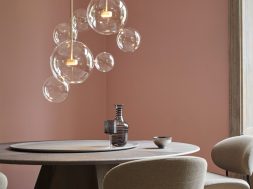
This season usher in vibrant colours in your interiors for an instantly uplifting and rejuvenating space. The colours used in our habitable spaces and the buildings we walk by or spend the most time in profoundly impact our lives. It is statistically proven that every shade has a different impact on human psychology, comfort, and emotional well-being. For instance, cooler tones such as blue can help one relax people, while shades such as yellow and white can keep one focused and upright. Negative emotions can also be triggered with the extensive use of red. As architects and designers of tomorrow, it’s one’s responsibility to use optimum shades in a space that imbues comfort and warmth to the occupants.
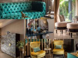
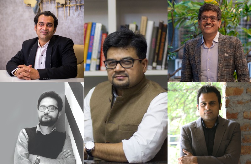
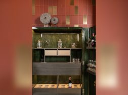
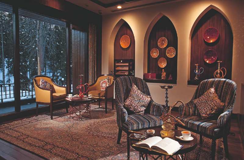
Ar. Khozema Chitalwala, the Principal Architect & Designer at Designers Group, a hospitality design firm in Mumbai has an enigmatic approach towards hues and shades. Hospitality projects delineated by him showcase an assortment of colours through furnishings and decor. Most of the hotel brands world-wide come with a brand guideline where the inspiration is to be taken from the regional and cultural influences of the geographical location the project is based in. The idea is to translate these traditional influences into a contemporary setting for him. He sees colours as an opportunity to incorporate cultural elements into an indigenous format skilfully. Using colourful rugs and furniture, patterned upholstery, digital wallpapers, and decor pieces in a myriad of vibrant colours grant his projects the perfect traditional- contemporary aesthetics.
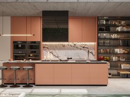
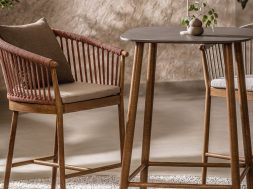
Ar. Gaurav Pathak, Founder of the esteemed design firm- Design21 Gurugram, believes in minimalist luxury even when it comes to colour. Being futuristic in his vision, Gaurav prefers muted undertones as they give an open canvas for the owners to decorate and personalize their spaces in the future. For him, colours, patterns, and textures all come in symmetry while designing any living space where colour dictates the overall ecosystem of the space, defining the accessories, furnishing, and furniture surrounding it. He recommends going full board to give the area an overall feeling of warmth and coziness.
 He specializes in designing bespoke villas, workspaces, and hospitality projects with evocative colour and material schemes for each space to lend an aura of sophistication and opulence. Different typologies of projects strive for different schemes; where a muted palette is preferable for a high-end residential setting, a workspace aspires to a cool scheme to foster creativity, and a bold colour scheme is best suited for hospitality projects.
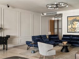
Ar. Robin Sisodiya, Founder and Principal Architect of ASRO Arcade masters in creating engaging and distinct architectural facades that are sustainable in nature. He has an affinity towards the monochromatic colour scheme that includes mostly- grey, black and white. He firmly believes his core colour scheme, when incorporated strategically, it creates a minimal layout that feels modern and sleek in nature. 
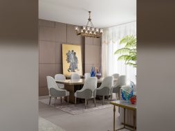
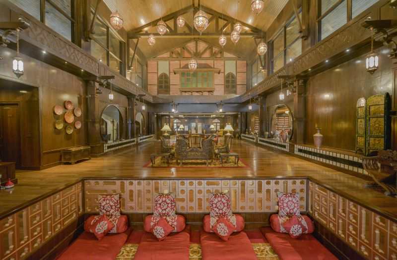
Ar. Anil Badan, the Principal Architect of the hospitality design firm Studio B Architects uses vibrant colours in minimalistic designs as an accent to lift or add punch to the overall color scheme for his hospitality projects. Firmly believing in promoting lost art, and local artists, the architect gives them a chance to translate these ancient art forms in a contemporary language through colourful artworks. For him this noble cause not only gives these artisans a livelihood but also gives his projects the apt narrative to epitomize the idea of luxury. Contextual and sensitive design that reflects on the choice of colour scheme to materiality and textures have always been a core consideration for the architect.
According to Abhishek Chadha, CEO at The KariGhars, colours stimulate creativity. He believes in exploring design with bright colours. He considers the conventional definition of luxury to be all about neutral colour palettes as it gives a canvas where one can bring in changes very easily at the time of festivals and different seasons. For him, the idea is to incorporate a cheerful palette that accompanies vivid pop of colours for his projects. He tends to go the extra mile to find décor pieces that can serve as a conversation starter and are pleasing to the built environment. Green colour through indoor planters also acts wonders in a neutral backdrop setting.
Abhishek’s forte is designing bespoke residences for his clients. He induces bright hues in the form of rugs, cushions, art pieces, wallpapers, accent walls, furniture, and lighting elements in an overall neutral palette, magnifying the impact of these colours.
In conclusion, understanding one’s space is essential as it reflects on the user’s behaviour and moods. Each colour connotes different impacts, so one should ensure the right shade is used for the targeted feel and vibe.