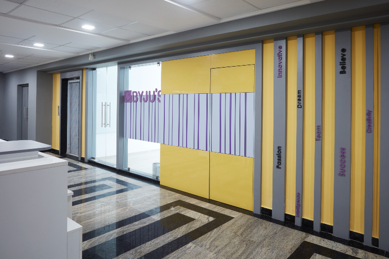
Located in VIPL, Nagpur Byju’s office-study space designed by Salankar Pashine & Associates is a reflects an amalgamation of creativity and brand engagement without compromising on the necessary essence of learning and growing as a student.
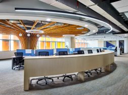
A mesmerising workspace design for Vidarbha Infotech Pvt Ltd, Byju’s at VIPL I Park is a stunning and functional office space by the Team at Salankar & Pashine showcasing their architectural design the prowess that aims to accommodate a large number of people. As one enters the office, it divides into a north and south wing. Both of these wings directly lead to a spacious area where students are provided with a study space.
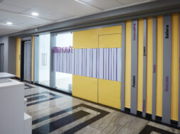
The walls and pillars in the study section have been smartly colour-coded, with motivational quotes printed on them. At the same time, the study space has floor-to-ceiling windows that allow in plenty of natural light, boosting the productivity of the students. The design was systematically schemed to be completed within 3 months, starting from mid-April and to be handed over in June.The reception has gilded marble tiles, with the reception table space placed aptly at the focal area. Flanking the reception area, the consultation offices are appropriately placed in the flow of the office. The office interiors have been crafted using Byju’s brand colours of yellow and purple. Posters on a yellow wall, along with a grey-purple carpet make the bright coloured furniture pop.
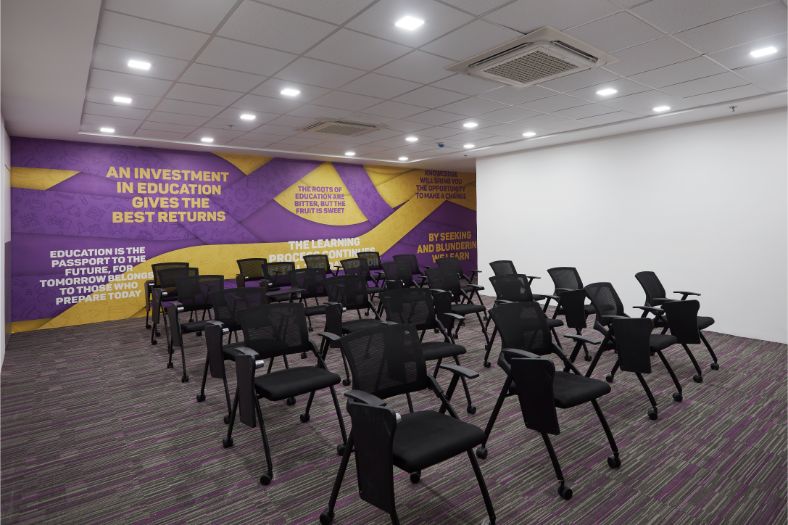
Elucidating on the colour strategy Anurag & Pallavi Pashine, Principal Architects, Salankar Pashine & Associates say “Choosing the perfect colour scheme deems pertinent when it comes to space interiors. Incorporate different colours in order to bring liveliness to the space. Vibrant hues in the office add life to the interiors. Tones like red and orange have proven to increase productivity, whereas colours like green and blue help in relaxing. A perfect combination of cool and warm tones brings a positive vibe to the work environment. As color psychology plays a vital role in the productivity and the overall environment of the workplace, incorporate a bright shade of color that makes the place seem lively or a lighter shade to add elegance to the spatial layout. Having said that in this project. to increase belongingness, we chose a palette that is related to the logo of the company, as it is ideally advisable to use various hues of the shade in the brand logo if not the same color. Increasing morale in the office is crucial. The motivational quotes on the walls demonstrate to be of significant help. It fills people with a burst of enthusiasm that can enhance their work efficiency as well.
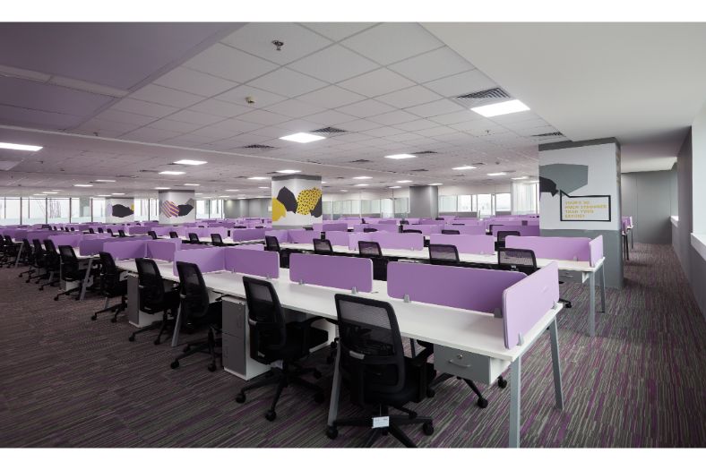
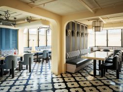
“The office space also makes good use of natural light,” point out Anurag & Pallavi, “natural lighting is essential to promote a productive work day. The right lighting can transform the working environment and help the employees concentrate to get the tasks completed. Further, natural light uplifts the spatial interiors, creating an ambience that is cozy & wholesome. It is thus advised to get rid of the dark curtains and make full use of french windows, as they aid in improving one’s physical and psychological well-being, ultimately, making work enjoyable.”Beyond the reception area lies the cafeteria and the gaming zone. With abstract live art placed on the accent wall, the cafeteria has beautiful windows that let in a lot of natural light to boost the serotonin of the users. The interior spaces were segregated into offices and rooms with the help of glass partitions, and the ceiling was made of Armstrong, along with acoustic panelling. The additional lacquered glass has been used in the office as well. A dedicated classroom has been placed behind the north wing, where students can peacefully learn new concepts and ideas. Right next to the classroom is the meeting room, fully equipped with a comprehensive projector system.
The client called for economic use of space that could fit in the maximum number of people in the offices and in the cafeteria. The entire workspace is centrally air-conditioned as well. Diffused white light has been used extensively to support muted colour schemes of white, black, & grey that have been incorporated to blend with the brand colours. The 20,000 sq ft of space has been methodically planned and designed within the given timeframe. The hybrid of an office-study space has been economically and innovatively captured by the team at Salankar and Pashine Associates while using the necessary essence of learning and growing as a student.
