A Sense of Identity
In executing an office project for a client, Ansa Interiors took note of the their authentic personalities to create a highly functional and utilitarian workspace.
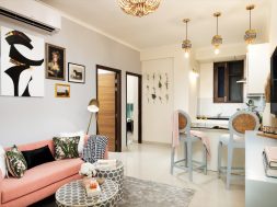
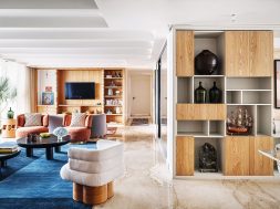
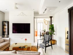
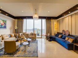
Located in Gurugram, this 1500 sq.ft. house is a plush three-bedroom apartment oriented North-East in a housing society. The house breathes an ample amount of natural light because of its orientation and wide UPVC openings, elevating the interiors. Moreover, every room has a balcony overlooking the gardens of the society. Driven by the idea of sanitization and safety, the servant room right at the entrance of the house was replaced as a sanitization room. As one enters, he can clean himself up and then move ahead. The living room opens into the terrace, looking out at the greens around, making the space look bigger and connected to nature.
Located in the hustle and bustle of the capital, New Delhi, this workspace design by Ansa Interiors creates a majestic aura with a human-centric approach that permeates zest and motivation for the employees. The space fosters creativity while granting an air sparkled with inspiration and motivation. The office aimed to create a highly functional and utilitarian workspace for the client, who had a real estate business. There were numerous builders in the area, but after conscientious collaboration between the client and the designers, they decided to generate a lot of buzz around the “B” word.
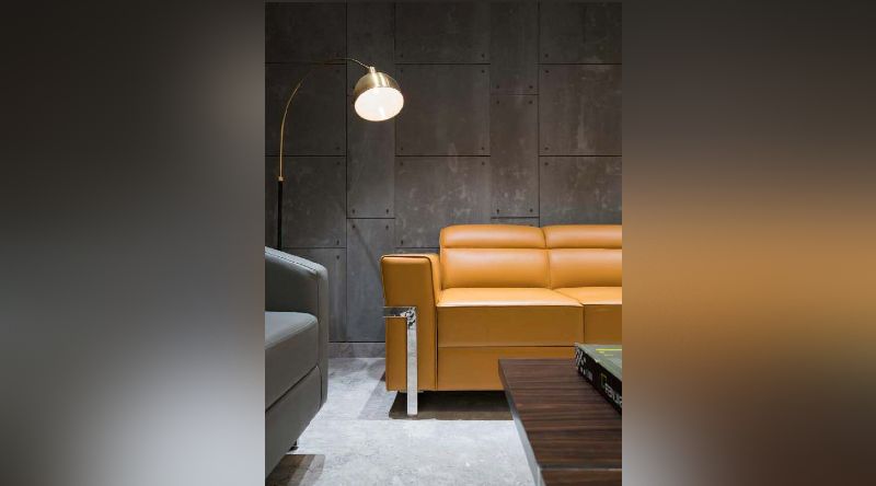
Being a real estate office, the place expected to have extensive footfall; therefore, the layout was presented in a manner that the office would feel airy and open without feeling too claustrophobic. The heavy footfall in the office was one of the major factors that guided the overall design of the workspace. Apart from the unorthodox approach to the interior design of the space outlined for augmented business, the office furniture has also been picked with keen attention to comply with the desired experience. The example of the furniture chosen is in collaboration with Furniture Tech, a brand of luxurious furniture pieces with a vast experience of working with leading five-star hotels, multinational organisations, financial institutions, and high-end residences for HNI’s. The overall design scheme was outlined with a vision that accentuated cooperation between colleagues to nurture progress as every team requires a versatile space that is appealing and conducive to developing their work.
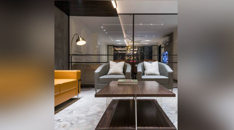
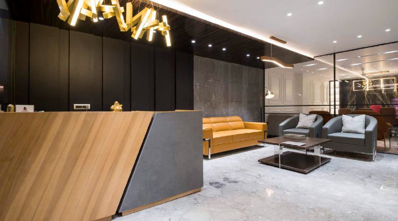
The reception is designed to express an uber-modern tone with one thought in mind – the power of first impression. It has a well-thought-out layout, uncluttered & clean lines, and idiosyncratic furniture design. The furniture incorporated here demonstrates an asymmetrical symmetry. The wooden reception table flaunts a diagonal cut that divides the table facet into two parts finished in wood slats and concrete tiles, respectively. The coffee table helmed in the premium wooden finish on top and bottom with chrome finish legs grants a mystique elegance to the area. The seating upholstered in stain resistant leather complements the overall schema and brings together the rustic essence of the space. The sofa set was stylish and comfortable yet durable to withstand the anticipated wear and tear as waiting hours for people in this area could be long. A mixture of contemporary and modern finishings is evident here, with an overarching use of heavy fabrics and materials such as wood, leather, and stone.
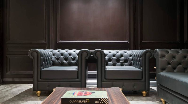
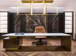
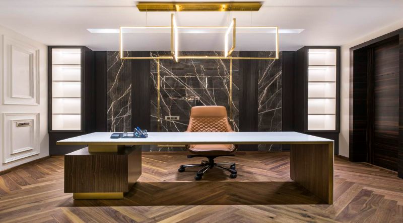
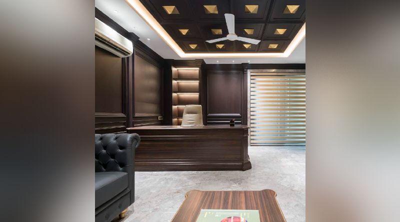
On the other hand, the father’s office is decked out in a classical design style, and a neo-classical style has been used as a theme when designing the managing director’s cabin. The table designed for this cabin is an amalgamation of veneer with a stone top and metal band in brass finish, and the chair is upholstered in leatherette and stainless steel in brass finish. The chesterfield sofa upholstered in leather here serves as the perfect and snug seating space for the visitors. Just as the reception uses a lot of rich material, so do these offices, which use marble, wood, and leather as the main functional elements in the room. The classical and neoclassical style demonstrates the solidity, stability, and experience in the interiors so that the clients feel more comfortable in the office.
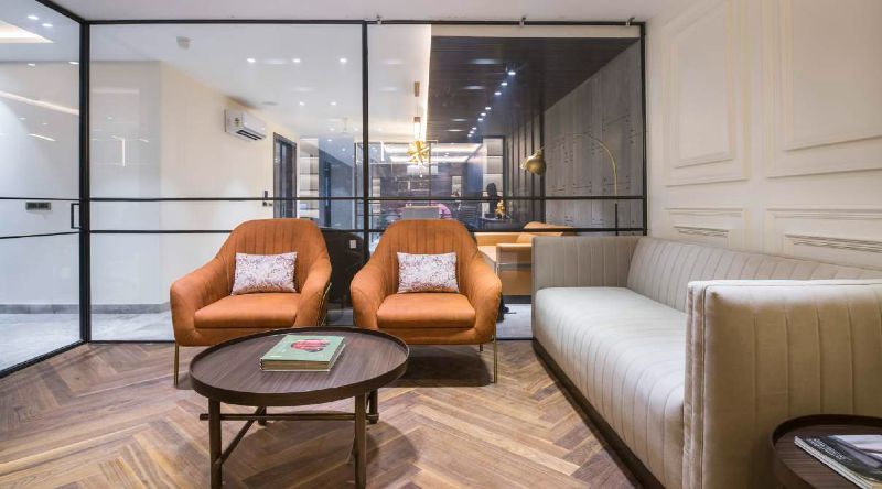
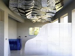
In order to express the generational gap between the father’s office and the managing director’s office, a different stylistic approach has been taken for both of them. So, for instance, the father’s room was done in deep colours while using dark wood grain with pyramids on the ceiling. But for the managing director’s office, a lighter and jovial tone has been adopted since it was done in white, offset with black stone, burnt orange tones for leather.
The main aim of creating this office was to have two main cabins for the father and the managing director. But the rest of the open spaces were meant to be open workstations for the office employees. In order to incorporate the twin ideals of making the office look homier and humane, a sense of belongingness was added by ditching the typical office layout, thereby acknowledging the needs of the employees.
Luxury is not a matter of size but a sense of style. Any high-end interior design is well executed and emphasises quality apart from taking care of comfort, quality, detail, and sophistication.
This project was bent on users’ authentic personalities, and that’s what the designers aimed to create in the area.
