A Creative Juxtaposition of Simplicity and Ornateness
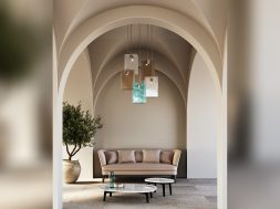
Located in DLF Magnolias 807, Gurugram, Haryana Vista Still is a haven of minimalism with ornate features.
Spread across 6000 sq. ft. Vista Sill is a duplex constituting drawing room, dining room, kitchen, family lounge, study rooms, four bedrooms with attached toilet and dresser, decked terrace. The tenants dreamt of a spacious and full of light apartment that would provide an accurate response to their needs. The guidelines were to create a modern and minimalist design that balances beauty and functionality.

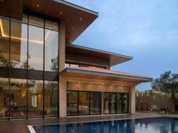
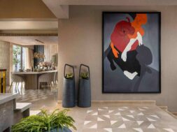
The main feature of the apartment is a magnificent view and the fully glassed façade that allows to enjoy this view fully. The two levels of the pent house are planned to allow separation of different functional zones- the lower floor being the active social zone and the upper floor being the private chambers. In the middle of the layout is situated double-height foyer that connects the apartment with staircase and is accentuated by shell art sculpture and light installation which is perceived to have different intersections at different views.
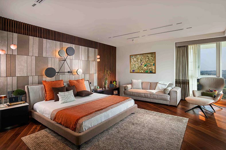
The whole apartment is layered with iconic works of art that encapsulates warmth of the household. The residence also features plants as ornaments of the space, ensuring a piece of nature within. Each transition is carefully thought out to create an experience for its inhabitants.

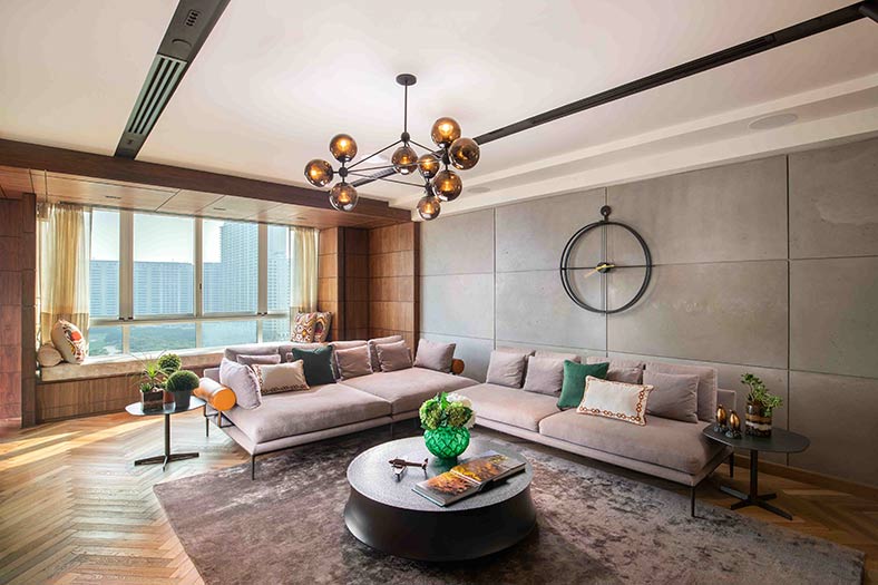
The lower floor is designed to allow free flow of people moving along a low height passage into a double height lobby that finally opens up to a decked terrace with sliding windows enabling the interior space to interact with sunshine, greenery and air when it opens. The transition maintains a relationship with the human scale at the same time expels a sense of grandeur. The living room, drawing room and the kid’s playroom open up into the center double height lobby creating a fluid public zone of the house.
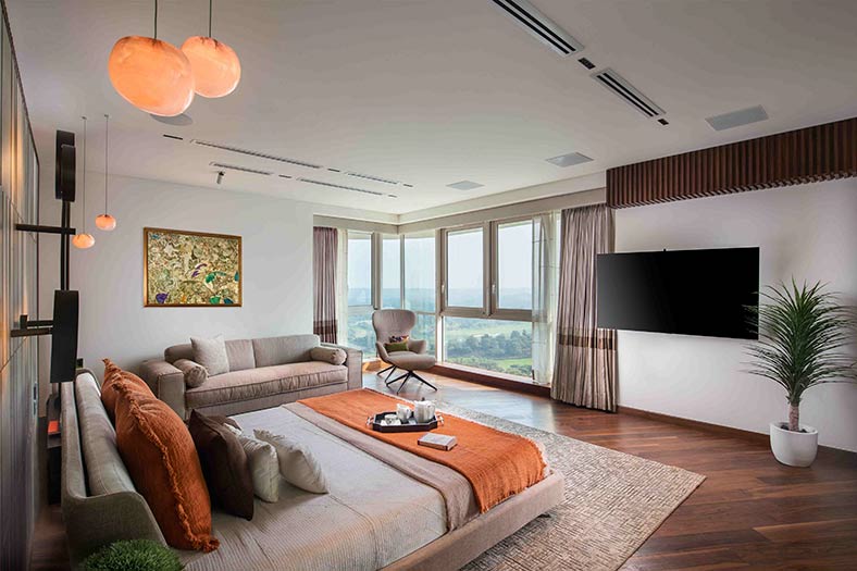
During the day the inhabitants mostly use the lower floor and wanted their kids to have a space to spill over. Hence a play room was conceived and designed as an interactive space for the kids to spend their time with the family. Also, another secluded meeting area is a part of the lower floor where the inhabitants entertain any official meetings. This zone can be completely shut out of the common areas ensuring a peaceful work zone. The upper floor bedroom layouts were also crafted to take advantage of the exquisite view through the windows. This also formed an inspiration for personal seating dens or reading corners that added a new character to each room.
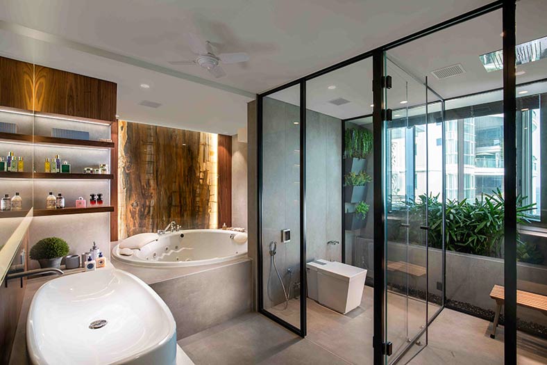
The services are compacted and concealed throughout the house, to stay true to the minimalist anatomy. Even the kitchens have concealed storages. Hence the walls are perceived as a single monolith. The inert spaces like the bathrooms have a subconscious sense of greens. We devised a backlit stretch fabric with a mountain view in one of the washrooms substituting the absence of natural light and preserving the sense of greens.

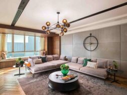
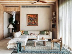
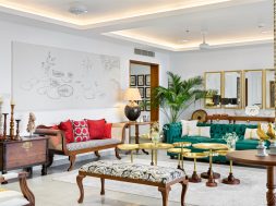
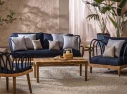
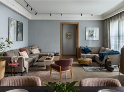
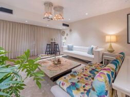
The color palette is largely composed of neutrals grey, black and white tied together in one rhythm with the use of wood. The color in the house is brought by the tapestry, upholstery and art work. The carpets rugs and art collections are carefully curated with respect to the family’s taste. Each work of art has a story and history to itself. For instance, the ‘Venice console’ demonstrates the value of timber by using historical poles reclaimed from venetian canals. Each room is embellished with exclusive furniture pieces & wall arts which are not just iconic but are rich in meaning as well.

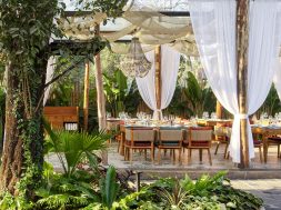
A conscious use of plants as an ornament is seen throughout the house with indoor potted plants. A new level ornamentation was achieved by the use of planter chandeliers as an art installation for the deck area. The material palette is mainly constituted by wood, metal, concrete and stone. The use of stone is limited yet artistic such as art wall paneling in the drawing room.

Each aspect of the house is designed to stay true to the minimalist anatomy yet not lose the inherent warmth of a household. The inert bareness of minimalistic design was accentuated to create a captivating and engaging experience for both the inhabitants and the visitors.
